Welcome to my A2 media blog

Welcome to my A2 media blog.
My name is Gavin Fraser (0245). I am part of Group 1 along with Alice Cahill (0130), Kayvon Nabijou (0610) and Mahalia John (0345).

You can navigate my blog using the right hand side column where you will find:
Some information about me
My post labels including 'A2 Production', 'A2 Prelim' and 'A2 Research and Planning'
A live link to The Latymer School Music Video Blog
The blog archive of all my posts

Thank you for taking the time to look at my blog.

Music Video


Digipak

Digipak
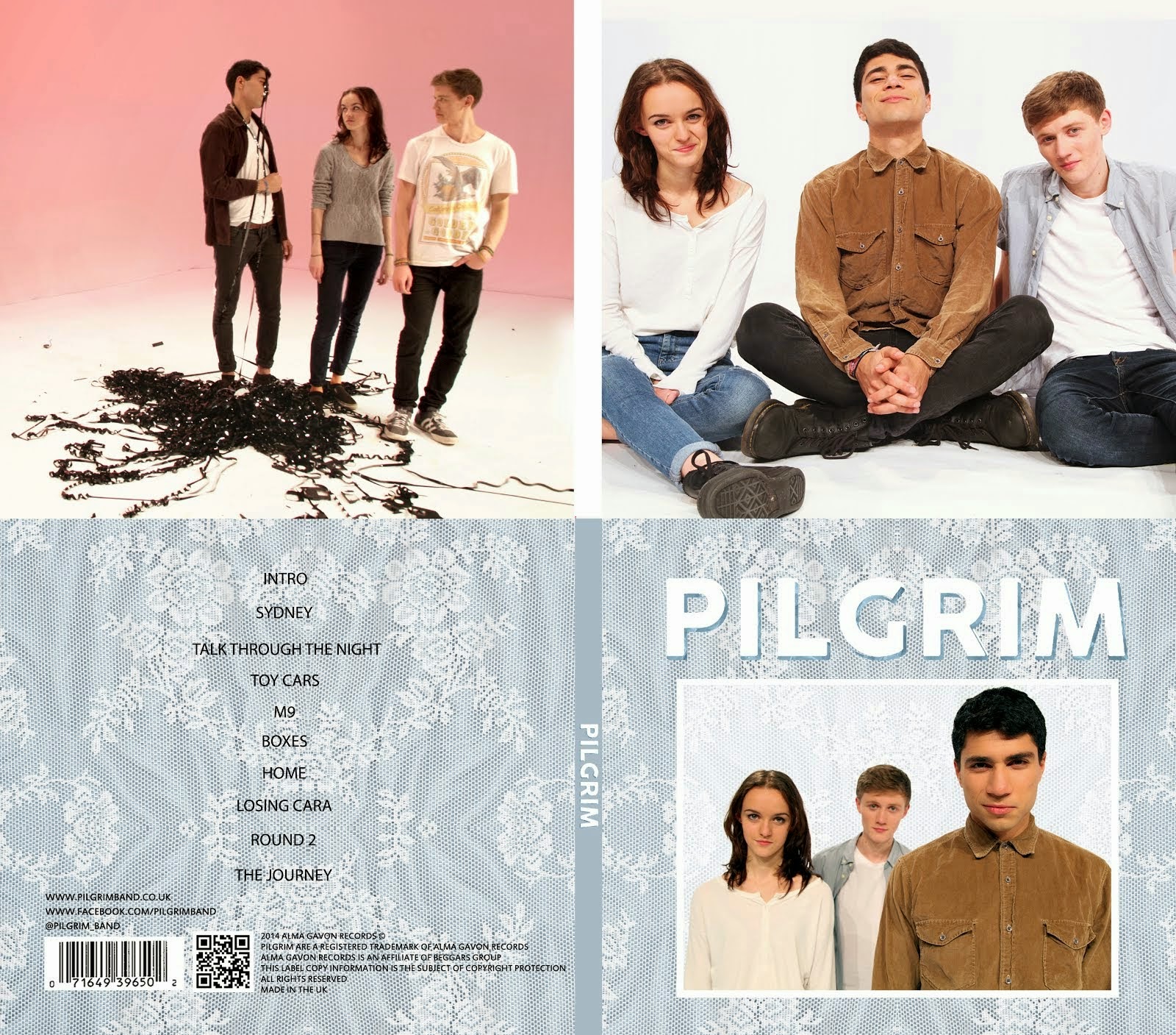
Album Digipak // Top-left to bottom-right: inside back, inside front, back cover, front cover

Website

Click Image to open Pilgrim's website in a new tab

Wednesday 4 December 2013

Live Youtube/Google+ Hangout With Peter Jackson, Evangeline Lilly and Richard Armitage - 4th December

People from all around the world watched PJ, EL and RA answer questions live on Youtube. The comments section shows people from Russia, Spain and other countries whos' languages I can't understand interacting with each other.
A lucky 6 people from different cities around the world were chosen to be a part of the event and were able to ask questions directly to the stars via their webcams.

Here they are being questioned.

It was streamed in HD because modern tech is great. Oh how I love web 2.0. 

This was the Google+ page for the even, linking to the Youtube stream.

This was a 'Chrome Experiment' that was advertised at the start of the stream that allowed people to journey through a virtual Middle Earth. It's basically a little game where you run around and fight orcs so it's not really an experiment because that's been done countless times before but it's the thought that counts.

This was the Facebook post that first informed me about the event. It linked to the Google+ page which then linked me to the Youtube stream.

Monday 25 November 2013

Tracking - Kill Your Darlings

 An online article on The Mirror interacting with fans of Daniel Radcliffe and promoting Kill Your Darlings
 A post on a Daniel Radcliffe fan site showing a poster for the film that has been released recently
An online article on The Daily Express targeting fans of Harry Potter and promoting Kill Your Darlings

Daniel Radcliffe appearing on The Graham Norton Show, promoting his film. The clips was uploaded to youtube by a fan. 17th May.

A youtube search of 'Kill Your Darlings' showing trailers and interviews with the cast.

Daniel Radcliffe's facebook page with a banner advertising the film.

I will indeed be spreading the word.


Tracking - The Hobbit

Links to the Facebook page and Youtube channel for The Hobbit on the official website 

An article on The Metro website about Ed Sheeran writing a song for The Hobbit

An article on The Independent website showing people the trailer for The Hobbit

 A youtube search for the film, showing trailers and behind the scenes production vlogs. There is also a super-cool review of a lego set based on the film.
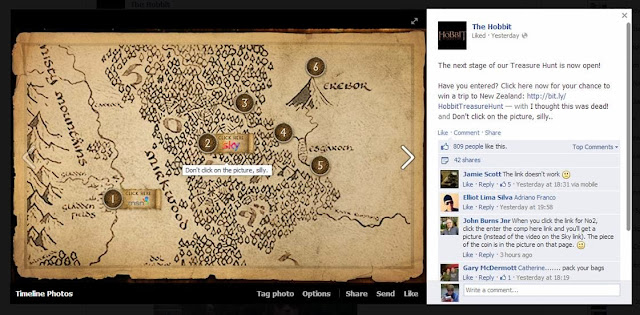
 A stage in the 'treasure hunt' posted by the official facebook page of the film.

The Hobbit is on a plane. It's in New Zealand which is where a lot of the film was shot.

There was a live hangout on Youtube/Google+ where people could ask Peter Jackson, Evangeline Lilly and Richard Armitage questions about the film. See separate post for more.

This was built in Bucharest, Romania. It is raising awareness of the film's release.


Sunday 17 November 2013

Film Industry Case Study 4 - Kill Your Darlings

UK Release Date: 6th December 2013

Production Companies: Killer Films, Outpost Studios, Benroya Pictures

UK Distributor: The Works

Nationality: USA

Genre: Drama/Romance/Thriller/Biography

Director: John Krokidas

Star Names: Daniel Radcliffe, Michael C. Hall, Elizabeth Olsen

Plot Summary: A Murder in 1944 draws together the great poets of the beat generation: Allen Ginsberg, Jack Kerouac and William Burroughs

Target Audience: Men and Women aged 25+, People interested in the 1940s, Fans of Daniel Radcliffe/Harry Potter

Film Industry Case Study 3 - The Hobbit: The Desolation of Smaug

UK Release Date: 13th December 2013

Production Company: MGM

Distributor: Warner Bros.

Budget: $250,000,000

Nationality: USA and New Zealand

Type of Production: High concept Hollywood Blockbuster

Connection with Other Films: 2nd film in 'The Hobbit' series. Sequel to 'The Hobbit: An Unexpected Journey'. Part of the follow-up trilogy to 'Lord of the Rings'.

Director: Peter Jackson

Star Names: Martin Freeman, Benedict Cumberbatch, Orlando Bloom, Richard Armitage, Cate Blanchett, Ian Mckellen, Andy Serkis, Stephen Fry, Billy Connolly, Sylvester McCoy

Plot Summary: Bilbo and his crew need to travel through a scary forest and then find a secret door in a mountain that leads to a big dragon before stealing it's gold and escaping.

Target Audience: Fans, of all ages, of The Lord of the Rings or of The Hobbit. Fans of thrillers and big-budget Hollywood films. Fans of any of the stars.

Monday 11 November 2013

Pap and Sons - What I Learned from Marcus

Marcus Markou, the film's writer, director and distributor, made me realise that genuinely good films can be successful, despite a small budget, as long as the available resources are used correctly. Marcus didn't have a lot of money to distribute his film compared to Hollywood titles. He was competing against films that had multi-million dollar budgets on his release weekend. Despite this, his film was the second most popular film for that weekend (or something like that) and it was successful because he used his resources well.

He knew who his target audience was and he knew how to target them. He used his money to get Greeks involved and interested in the film. Instead of buying advert spaces on buses and bus stops all over london, he used his money to get the word out at Greek churches, handed out flyers in greek areas and had adverts on Greek radio stations.

This all meant that when the film was released, depsite comparatively spending nothing on distribution, his film was more successful than many big-budget films. Basically, he was resourceful, he knew what he needed to do to make the film popular and he precisely targeted his audience. Well played Marcus.


Sunday 10 November 2013

Papadopoulos and Sons - Research 2

MARKETING AND DISTRIBUTION
The film was advertised using all teh conventional platforms. A poster was released alone with a theatrical trailer. A website was set up with a blog by Marcus, giving people updates on the progress of the project. However, this film's popularity got a huge boost from social media. Sites like Facebook, Twitter and Youtube, among others, were used to spread the word of the film and to help it go viral. 

Marcus's company, 'Double M Films', distributed the film. This was done completely independently. Marcus took the film to festivals around the world, spreading the word of the film and generating interest in it. The film won an award and interest continued to grow. The film was eventually released in Greece in 2012 (Greeks being the primary target audience for the film), and then released in the UK and Ireland a year later, (this year).

Papadopoulos and Sons - Research 1


Papadopoulos and Sons is an independent British film, written and directed by Marcus Markou. Released in 2012, it was hugely succesful despite having a small budget. It is a great example of how a small budget can be used effectively to distribute a film.

Set in London, this film tells the story of Marcus Papadopoulos, a vastly rich businessman who makes a bad investment, loses everything, and is forced to re-open an old fish and chip shop with his family his brother. Reluctant at first to come to terms with what has happened, he eventually realises that money is not important and begins to apprectiate things like family.

Reviews were the film were fairly average. Generally, it was described as a feel-good film with charm and character. It received a 6.2 out of 10 on IMBD and 3 out of 5 stars from The Guardian.

Friday 25 October 2013

Shrek Sweded

Kayvon, Josh and I made a sweded version of Shrek. Here is a summary of the content we produced and our marketing strategy.

Facebook Page:
 Shrek Sweded Facebook page

Twitter Account:
Sweded Shrek Twitter account 

Promotional Poster:


Trailer:


Finished Film:

Sunday 13 October 2013

My Ideas for the Sweded Film Project

  • Inception
  • The King's Speech
  • E.T.
  • Avengers
  • Shaun of the Dead
  • Finding Nemo
  • Shrek

After brainstorming possible films to swede, this was the list I came up with. I was trying to think of films that were very popular so that lots of people would know the film we were sweding but also that had potential for being funny to swede.
I'm still uncertain about which film I want to do, but I think that Shrek, The King's Speech and Inception have the most potential as they contain things that can be greatly exaggerated.

'Sweded'

A sweded film is a very low-budget remake of a popular film or film trailer. They are mostly unedited with only one take per scene. They are also quite short, only including the most important and iconic scenes from the film. Generally, they are under 4 minutes long. The term comes from the film 'Be Kind, Rewind'.

Here are 2 examples of sweded films/trailers:


Tuesday 8 October 2013

DEXTER Opening Sequence Activity

Summarise the conventions of title sequences that were most important to this task.

Film openings need to show the people behind the film. There is a minimum number of titles that must be in the title sequence.
On a more artistic level, the titles should add to the sequence and should not be an annoyance. They can be used to draw the viewer's attention to a certain thing on the screen. They can be embedded into the environment. The actors can actually interact with the titles, creating a very interesting effect. However, no matter how it is achieved, the titles should be used to make the sequence better. They should be interesting, following the theme of the show and having a sense of genre.
The sequence itself should introduce characters, themes or ideas, giving the viewer a taster of what the show is like and showing them what they can expect from the show. The sequence could be of a city skyline, a character's morning routine, a small montage of the show's highlights or a series of graphics. Whatever it is, it shouldn't just be a filler. It should be interesting and enjoyable. If the sequence is very clever, it can subtly hint at things. This is done in the Dexter sequence.

2. How did your group plan to edit the title sequence? (consider timings, industry requirements etc).

We knew that we needed to include lots of titles so we decided that we should have roughly one title per shot. We did not have a lot of time so we got straight on with the task, having done basically no planning. We did, however, decide on a theme, a font to use and a colour scheme. We knew fairly well what we were trying to achieve so we went straight ahead and starting working on the sequence.

3. Explain the creative decisions made by your group.

We decided to make the titles white as white goes with almost anything. I also noticed that the sequence had lots of shots that contrasted white and red, such as the tissue or the sink with the blood. The main title was red so, to make it stand out, we went for white on all the credits. The font was quite gothic and formal. This decision was made, partly due to the fact that it looked good, partly due to the fact that it seemed quite formal and followed the sinister and fairly gruesome, bloody theme or the sequence and partly due to the fact that we didn't have much time to choose a font and we thought it was fine so we just went with it.
We started quite ambitiously, making the first title move with the camera. However, we soon realised that if we wanted to complete more than 2 or 3 titles, we would need to make them simpler. We placed the titles in parts of the screen that were near the action but not blocking it, drawing the viewer's eye to the action.

4. How does your re-edit compare to the original?

Out re-edit has potential but the original is definitely better. The original had a jumpy effect on some of the titles, creating quite a tense and on-edge mood. Our titles were simple and, while they looked okay, they weren't great at giving a sense of theme. I do actually prefer the font we used to the font used in the original sequence as I think it creates a more serious mood.
To improve out sequence, I would obviously finish it. However, I also would have liked to have more time to make the titles more involved in the sequence, making them more interesting. For example, when the man looks up at the mirror, I would have liked to have him reveal the text from behind his head, giving the scene depth and appeal. This all would need a lot of time and, with the time that we had, I think we did fairly well with our edit.
Josh also started messing around, it wasn't my fault, I swear.

Sunday 6 October 2013

Preliminary Video and Analysis


Preliminary Exercise: Continuity task involving filming and editing a character opening a door, crossing a room and sitting down in a chair opposite another character, with whom he/she then exchanges a couple of lines of dialogue. This task should demonstrate match on action, shot/reverse shot and the 180-degree rule.

Who did you work with and how did you manage the task between you?

I worked with Molly, Mahalia and Enya. We tried to have everyone's opinions heard and to let everyone have a go with the camera or the clapperboard. We made sure that we were all happy with our idea before we started filming it. Mahalia and I acted in the film, leaving Molly and Enya to do the majority of the work with the camera. Mahalia and I did still film one or two shots and we helped decide how things should be shot. We all contributed shot ideas and were constructively critical of shots that we didn't like, meaning we were able to film our sequence well using good framing and camera shots.

How did you plan your sequence? What processes did you use? What theories did you try and take into account?

To begin with, we watched sequences from previous years for inspiration and ideas. We generally got the feeling that they were all fairly similar and we wanted to do something different and hopefully funny. Admittedly, we let our imaginations run a little too wild and our idea ended up not completely following the brief. However, our sequence did still follow all the rules of continuity and we felt that we told the story quite well.

We had no script as there was very little dialogue in the sequence and only a very rough storyboard that we ended up barely following anyway. However, we had all discussed the shots and the film and we all had a fairly clear idea of how we wanted the film to look. We tried to vary the shot types and to include interesting camera movement and angles.

Our sequence didn't really have a strong sense of genre. I would say that it roughly follows the spy thriller/comedy conventions. Genre was not the main focus for us, however. We mainly focused on telling the story fluently and interestingly. We were careful not to break the 180 degree rule or the 30 degree rule, varying our shots and angle. We synced up actions during editing and generally tried to make the sequence flow.

What technology did you use to complete the task, and how did you use it?

We used a HD camera mounted on a tripod to film our shots. It was small and therefore very mobile and the tripod was very useful for still shots as well as for adding stability for shots that had movement. The footage was filmed onto tape and then copied onto a computer and imported to Final Cut Pro - a non-linear editing program. We arranged the clips on the timeline, cut them so that there were no gaps or pauses, messed around with the audio levels so that everything was roughly at the same volume and, finally, did some grading to make the clips look nicer.

What factors did you have to take into account when planning, shooting and editing?

When planning, our main concern was conveying the story. However, we also had to consider location, times and what order we would shoot our different shots in. W decided that we would film all of the outside shots first as the entrance to the media block was being used for the first half of the hour. While shooting our track shot, we had to be sure that we did not get the reflection of the camera in the windows and it took a few tries to get a good take of the shot. Another thing we had to consider was if the lighting from the computer screens would be enough to show what was happening in the scene. We did a mini test shoot beforehand to make sure the light was sufficient. It was.

While editing, we obviously tried to take into account the continuity theory. We made the cuts quick and we made the sequence flow. Overall, we think the achieved what we wanted to as the scene flows quite nicely.

How successful was your sequence? Please identify what worked well, and with hindsight what would you improve/do differently?

Our sequence was quite successful. However, it could be greatly improved, mainly due to the fact that there is very little sense of genre. It also barely follows the brief. I feel like the camera work and editing was done well. The scene is smooth and the editing is subtle and not noticeable, meaning the viewer can become temporarily immersed in the scene without worrying about a dodgy cut or something that doesn't make sense in the scene. The shot types are varied and interesting and they show all the key details that needed to be shown for the scene to make sense.

In hindsight, I would have followed the brief more closely. There was no real conversation; only a reaction and a statement. The character did not open a door; it was already open. They don't sit down opposite the other character or cross the room. Clearly, I need to focus more on doing what the brief actually says instead of getting distracted with other aspects. However, other than this, I am actually fairly happy with how the sequence looks. It has personality and it flows and I'm proud of that.

What have you learnt from completing this task? Looking ahead, how will this learning be significant when completing the rest of your foundation coursework, do you think?

Most importantly, I have learnt how to create continuity in a sequence and I have also learnt that I'm actually okay at it, which is reassuring. I have also learnt that I need to stick to the brief more. This task has been very useful as it has shown my strengths and weaknesses and so I now know what I need to improve on. For example, I should probably spend more time planning and making sure my sequence will look okay before I actually go out and film it. However, I've learned that I'm pretty good at visualising how the sequence will look and thinking of different shots, framings and ways to tell the story. The editing process was also a nice reminder on how to use Final Cut Pro. I became quicker and more efficient at using the program and this will help me significantly in the future.

Sunday 29 September 2013

Art of the Title Grid Activity


Our film is about a boy who is paranoid. is paranoia cause him to see things and sometimes do things. In the film, it causes him to do something very bad and this is what drives the plot and moves the film along. In this film opening, the boy's daily routine is shown. It starts with him going to school, shows him eating lunch, doing his homework, etc, and finishes with him staring up at a dark and hellish sky. The idea was that as the day progresses, he feels more and more isolated and his visions and hallucinations become more vivid and demonic.

This opening does not give away a lot. It is obvious from the grungy font, the crack effect on the screen and the sky in the last frame that the film is very dark and psychological. The sequence shows the boy's isolation as he is alone in every frame, looking thoughtful and troubled. The words and titles in the sequence show some of the people who had important roles in making the film such as the actors and the director.

The titles link to the main idea of the film mainly by the font that has been used, which is scratchy, grungy and dark. The film is also dark and the audience get a sense of this straight away because of the titles. They are integrated into the scenes but they are not the main focus and do not draw the attention of the viewer away from what else is happening on-screen.

The opening is fairly ambiguous. It does not directly tell the viewer what is happening but it is made very clear that something is wrong, shown by the fonts and the cracked screen. It is also made fairly obvious that this is the boys daily school routine as he is shown getting books from his locker and studying. The audience are supposed to be wondering what is wrong, why the boy's world seems so dark and why there is such a great sense of isolation.

boy introduced. theme/genre introduced. enigma.

Three things that I included in my grid that are important in the construction of an opening sequence:
  • The main character is introduced. He is the only person in the sequence and so it is made clear that he will play an important role in the film.
  • The theme and genre are introduced. The opening is highly stylised. It is dark and slightly hellish (the sky in the final frame). Straight away, this tells the audience that the film will be very dark and psychological. It is clear that the film's genre is horror/thriller.
  • There is an enigma. What is the problem that the boy is facing and why is he seeing all these strange things? The audience is left wondering straight away about what is happening in the film, engaging them and making them pay close attention. This will cause them to be more immersed in the film and will hopefully make the film better.

This opening is quite effective. Obviously, with more time we would have been able to improve it. However, there is a strong sense of genre and there is a progression in the sequence. This makes it effective at introducing the film.

Sunday 22 September 2013

Hot Fuzz Opening Sequence Analysis - Continuity


The sequence starts with a very long shot of Simon Pegg walking towards the camera. The pace is very slow to begin with, leaving the audience wondering who the character is. As he comes into view, the voiceover begins and the pace picks up. Next there is a montage that shows the character's background. We are told things about his job, personality, previous experiences in the police force and other things. This is all done very quickly with the montage style editing, packed with quick cuts and wipes that are typical of films made by Simon Pegg and Nick Frost.

The camera is used well to introduce the character and his background. We get shots of the character from many different angles and the montage is packed with zooms and pans and lots of different shot distances, such as extreme close ups to show his determined facial expressions, a long shot of him helping people in the local community or zooms from a low angle as he skids on his bike to convey excitement and action.

The editing is very fast paced. All the different shot types are thrown together and we are bombarded with lots of different angles and things happening, giving the sense that Sgt. Angel is a man who's life is packed with action. The editing is very non-linear. It is constantly cutting between shots of him walking towards wherever it is that he is going and shots of his previous life as the voiceover describes them. This contant jumping about in time again adds to the pace and also helps to introduce the character.

There is a lot of parallel editing in the sequence that creates continuity. While we are not directly told that we are being shown his previous life, we can tell that this is the case because of the voiceover. The 30 degree rule is used a lot. There are a lot of cuts in this sequence and having lots of shots from different angles both adds to the pace and helps avoid the 'jumpy' feeling that can be created if two consecutive shots are too similar. The shot types are also varied enough so that the audience is not confused. While the sequence consists mainly of close-ups and medium close-ups, there are some long shots and mid shots that help to tie all the other shots together in space so that the audience isn't confused.

Accident Continuity Sequence


To create continuity, tried to keep a fast pace so that the audience was not left bored and felt the action of the sequence. Creating continuity was quite difficult as it was hard to film me falling out of a tree without me actually falling out of the tree. To solve this problem, we used quite cuts to different angles. This conveyed what was happening to the audience without it actually happening. We also kept the story as simple as possible to avoid any confusion as six shots is a very small number of shots to convey a story with.

To improve the narratvie flow, we could have jumped around a bit less with the angles. Doing this may have confused the audience about where they were viewing the event from at different points in the sequence. If I had actually been able to fall out fo the tree, we could have gotten better, more realistic shots of me falling without needing to do close ups to try and convey this. Another thing we could have done would be to introduce the other two characters in the first shot. They are not really involved until I start to fall and this might seem quite strange to the audience. By introducing them earlier, the sequence would have flowed better.

Wednesday 18 September 2013

Film Still Analysis


This is a film still from the horror thriller genre. It is taken from a very high angle, making the character seem powerless. She is reaching towards the camera and looking directly towards us. This direct address adds a sense of urgency to the scene as she is trapped in the confined space between the two storage crates and trying to escape. This sense of urgency and danger is what makes this still typical of it's genre.

To achieve this effect, I climbed on top of one of the storage crates to get a very high angle, making the character seem small and powerless. Ideally, the shot would be a lot darker but we could not acheive this effect as this was shot outside. We took this shot in the darkest location we could find and made the most of what we had. The character's facial expression shows her fear and the enclosed setting adds to the feeling of powerlessness and claustrophobia.

The characters pose and the high angle are the most effective things about this shot. She is reaching for help, she is scared and she looks helpless due to the angle the shot was taken from. To improve the shot, we could have found a better, darker location to take it. If only her face was lit up, it would draw attention to her fear and make the shot more fitting for the horror thriller genre.

Tuesday 17 September 2013

Trainspotting Introduction Analysis


Trainspotting is a crime fiction drama film released in 1996. It is the story of 5 men and how their lives are affected by heroin.

This scene introduces the 5 main characters: Renton, Sick Boy, Begbie, Spud and Tommy. The first shot is two of them running from cops. The voice-over's thick Scottish accent immediately informs us of where the film is set. The scene jumps between this chase scene, a football scene that is used to introduce 4 of the main characters and a scene of the fifth character smoking heroin in his unfurnished and tattered home, before collapsing on the floor. These events are not chronologically related. The only links between them are the characters involved and the fact that they are showing us their lifestyles. The football scene gives the viewer glimpses of the characters' personalities but nothing much. For example, we know that Degbie is a bit of a twat because he aggressively tackles someone from behind and laughs about it. Spud, as the name suggests, is a bit dim-witted. He looks out of place and a football flies past him into the goal. We can tell that Renton is the main character in the film due to the fact that he is doing the voice-over. He also gets the most screen time.

The audience needs to know who the characters are, where the film is set, the mood of the film and roughly what the film will be about. This all gets them interested straight away, keeping the pace up and grabbing their attention. This introduction does that well.

Not a lot of story information is revealed. The scene sets up the film by introducing the characters, their personalities and lifestyles and giving us a sense of location (Scotland). The fact that the characters are running from police immediately connotes the crime genre and the heroin section is meant to be slightly shocking and attention-grabbing. However, we are not told that Renton is smoking heroin until the very end of the introduction.

"Choose Life. Choose a job. Choose a career. Choose a family. Choose a f***ing big television..."

The voice-over is supposed to be very monotonous, listing off the things that the average person is expected to choose in their life. This list steadily goes downhill, listing some of the less desirable aspects of this lifestyle. The listing makes it all seem unnecessary. Then the cycle is broken. As he collapses on the floor the voiceover says, "But why would i want to do a thing like that?" showing there's an alternative: heroin. "Who needs reasons when you've got heroin?"