Welcome to my A2 media blog

Welcome to my A2 media blog.
My name is Gavin Fraser (0245). I am part of Group 1 along with Alice Cahill (0130), Kayvon Nabijou (0610) and Mahalia John (0345).

You can navigate my blog using the right hand side column where you will find:
Some information about me
My post labels including 'A2 Production', 'A2 Prelim' and 'A2 Research and Planning'
A live link to The Latymer School Music Video Blog
The blog archive of all my posts

Thank you for taking the time to look at my blog.

Music Video


Digipak

Digipak
Album Digipak // Top-left to bottom-right: inside back, inside front, back cover, front cover

Website

Click Image to open Pilgrim's website in a new tab

Monday 27 October 2014

Meetings Summary: October 20-25


We did not do much creative work during this week. We focused on preparing for our first shoot, making sure that we had all the necessary documents ready such as the call sheet and the final props list. We also had two sessions in our studio where we were shooting. We had a tutorial on how to use the lights and then started working on our lighting setups for the different scenes in the video.

The lights in the studio

Thursday 23 October 2014

Set Design

We have two sets in our video. The first is for the performance shots and the second is for the shots with props. Mcfly's video for 'Love Is On The Radio' has influenced our set design quite significantly. We like the use of colour and will also have amps in the background. 

Mcfly - Love Is On The Radio

Performance

The drumkit will be in the centre of the frame at the back of the set. Kayvon, the lead singer, will be closest to the camera to the left of the drumkit. Alice, the bassist, will be to the right of the drumkit further back than Kayvon is so that it is obvious that he is the most important figure in the band. This setup is very typical of 3-piece bands.

A diagram of our setup
Props

For our prop shots, we want the set to be empty. We will still have colours in the background but there will be no instruments or amps. We don't want to draw attention away from what's going on in the frame and we want the shots to be obviously separate from the performance shots.

Colour

Most of the objects on the set will be black so that the band members stand out. The drumkit, the drum sticks, the amps and Alice's bass guitar will all be predominantly black so that attention will be drawn to the colourful things like our outfits and Kayvon's red guitar. 

Tuesday 21 October 2014

Album Cover and Artwork: Initial Ideas and Designs

This post has been arranged chronologically, showing the progression of our design ideas and how we got to our final album cover.

Initially, Alice did some research into fonts. She was looking for sans-serif fonts as our research into other indie album covers showed that bold sans-serif are very typical of the genre, (and look good). She looked on dafont.com and found nine fonts that she liked. Below are four of them that I liked in particular.

Primetime
Cocogoose
Triomphe
Alte Haas Grotesk

After finding these fonts, we used them to create some initial designs for our album cover. Alice found some textures online as well as some publicity shots for other bands that were fairly similar to what we want ours to look like. She then created the images below. None of them are intended to be final designs and are instead meant to be experiments with different ideas to see what works and what the group likes. 

Alice's Designs
(click images to enlarge them)


I like her use of texture in the background and the white border that she used in the first picture. I also think that having a black and white shot of the band looked very good. I used all these ideas and tried to build upon them for my first designs while adding my own ideas. I used a different shot of an indie band called Metronomy because I liked its composition and it had a white background which makes it easier to work with in Photoshop.

My Designs
(click images to enlarge them)


My favourite designs out of these are the top left one and the black and white one. I don't particularly like the textures that I used and the logo isn't very clear in some of the designs which is a big problem. I do like the overall idea though and I think the simpler designs look better which is something I kept in mind when making my next designs.

Alice's Designs (Continued)
(Click images to enlarge them)


I really like these four images. In particular, the top left and bottom right designs stand out as I like the paper texture that is used and the colour schemes of both. I also like the fonts used in the logos of these two images, (Cocogoose and Alte Haask Grotesk). However I thought that the image was too small in bottom right picture and thought that the top left one would look better with some kind of border. Again, these were all points that I kept in mind for future designs that I worked on. We also noticed that the logo Alice used was very similar to Muse's logo and changed it for our future designs.


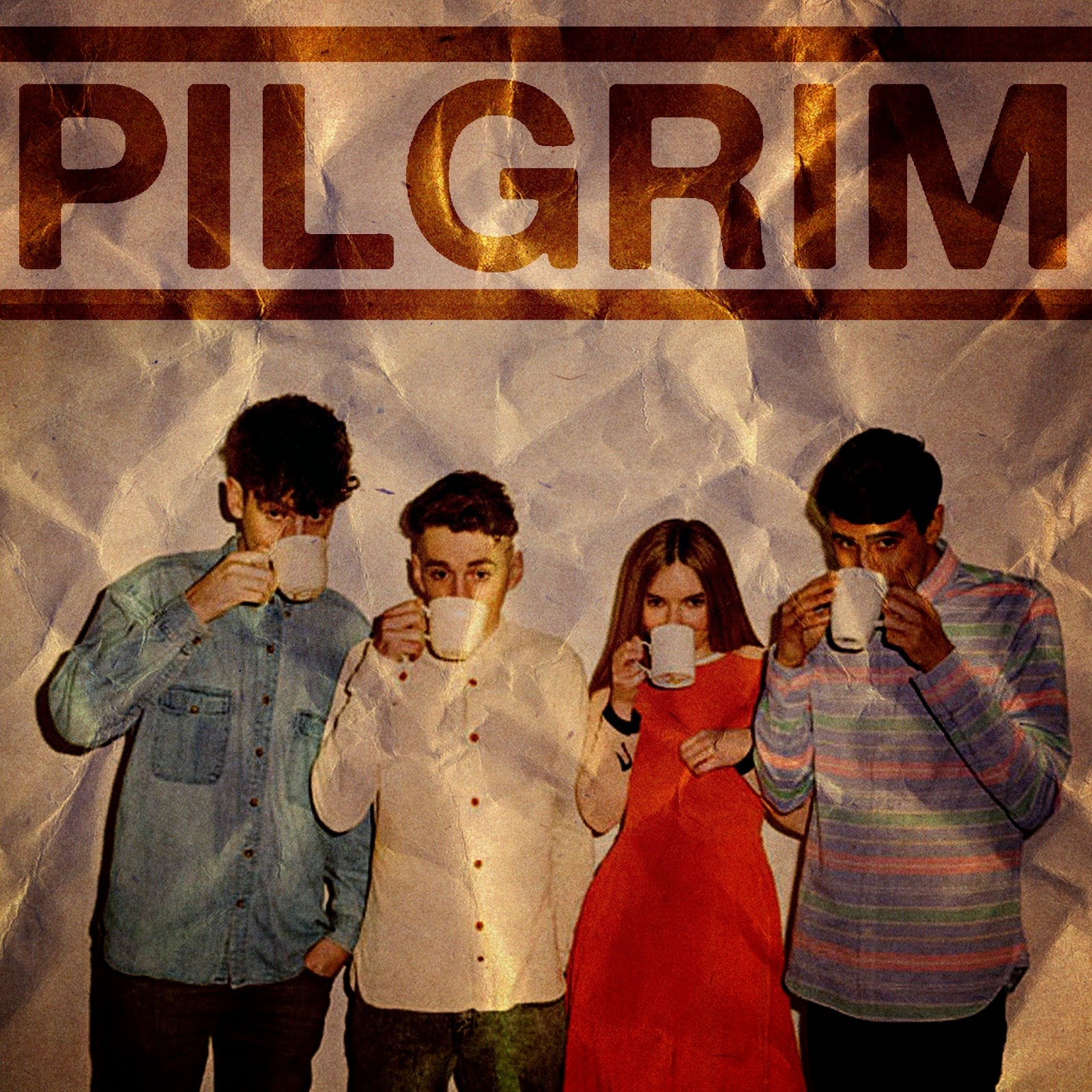
Alice, Mahalia and I then looked at Alice's designs and thought about what we liked about them and how they could be improved. We didn't think the black logo fitted with the colour scheme but we liked the textures used and the frame-in-a-frame idea. We then started to work on a design together and created the image below.


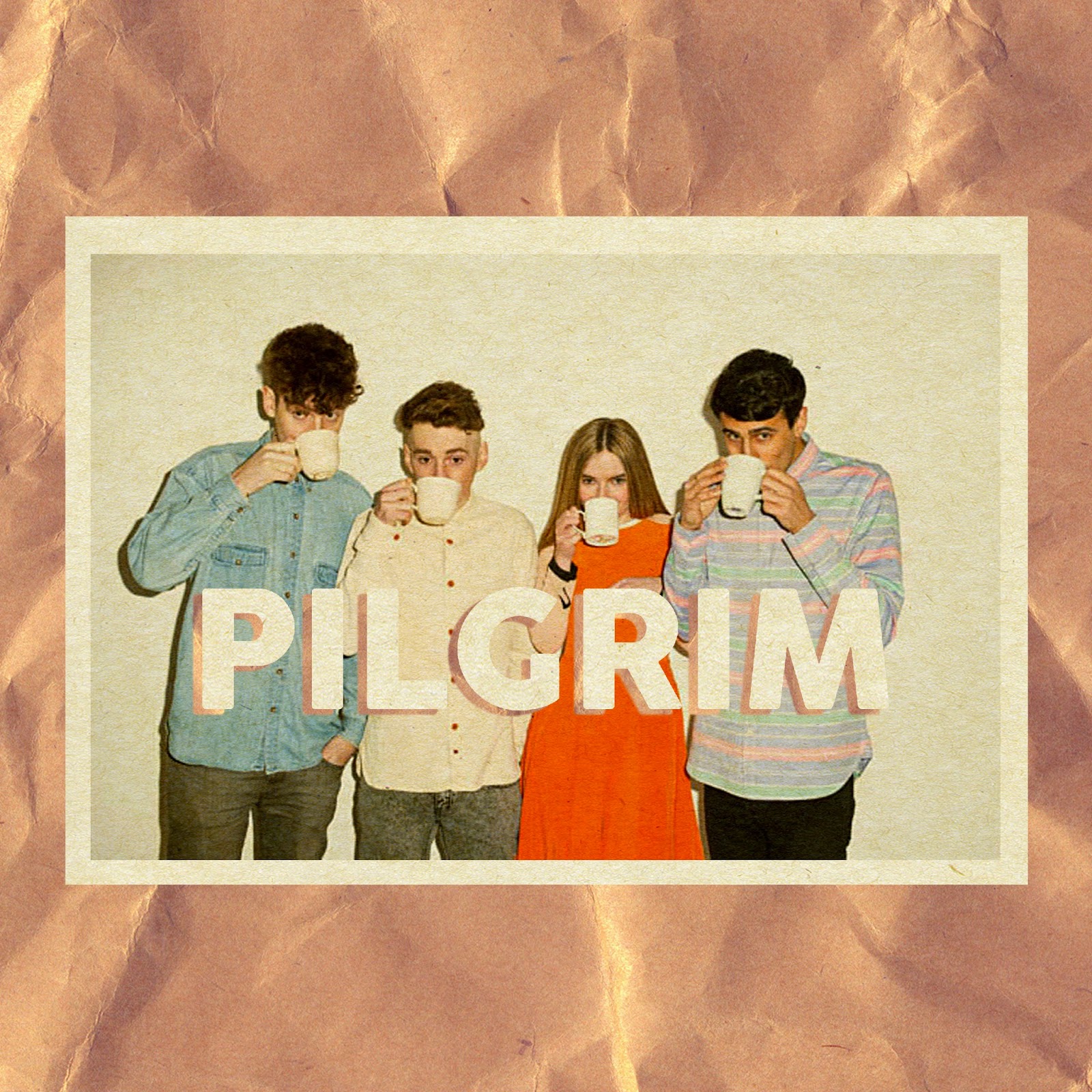
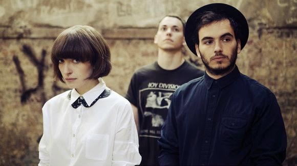
The image abov is close to what our final album cover will look like. We have used a picture of Clean Bandit for this design which we will obviously replace with a shot of our band. However we really like the paper texture in the background and the vintage colour scheme. After making this, Alice and I worked on improving it a bit by experimenting with shadows and adding depth. We created the two pictures below.


I then made the next two designs below where the letters' outlines are defined by their shadows. I also made a design where the picture was black and white but I thought the picture lacked colour overall. When I showed this font idea to my group, Kayvon liked it but Alice and Mahalia weren't as keen and thought that it wasn't eye-catching enough and that the word was a little hard to read.


Me and Kayvon then worked on these designs using a different picture of Metronomy. I like the effect in the second design where the paper texture in the background slightly shows through and the composition of the photo is quite nice.


This design is very close to what our final cover will be. I really like the use of texture for the text and the shadow and the desaturated picture look very indie. Mahalia was a bit concerned that the text covers too much of the picture but we agreed that this design would work well for the inner sleeve. We will look over all our designs as a group and work together to create our final cover.


Monday 20 October 2014

Meetings Summary: October 13-17

We really needed to focus on getting all the shots done as we needed to finish our animatic. The first thing on our list was to draw all the shots that we were going to have so that we could put them in our animatic, (the second thing on the list), and visualise our video more easily. We also started working on some designs for the album cover, although this was less important as we really needed to focus on the animatic. Alice did the majority of the work on album artwork although I did make a few designs as well after the animatic was finished.

Our agenda for this week
Shot sketches (Different colours represent different shot types)

We had a session with an ex-student during the week who specialises in make-up. She discussed what look we were going for in our video and put some make-up on me to show the others how to do it for the shoots. Kayvon and I are keeping it fairly simple, covering any spots or scratches on our faces. Because I have blonde eyebrows, I will also have some make-up on them so that they are defined enough to look good on camera. Initially we were going for a simple look with Alice too but we have since decided to make her stand out a bit more as we want an aspirational and unique female bassist and simple make-up would make her blend in a bit instead of standing out.

Testing make-up on me

Our notes from the make-up session

We started work on our album cover. Below is a scan of a page of notes that we took on some covers that we liked in particular as well as two very rough sketches of possible designs for our cove; the top one is mine and the bottom is Alice's. We had fairly similar ideas and are in agreement that we want a bold sans-serif font with a border and an image of the band.


Some notes on album covers that influenced us
Early sketches of possible designs for our album cover

Tuesday 14 October 2014

Publicity Shot Influence

We want to have a shot of our band on our album cover as this is fairly typical of debut album covers and established our band's image well. We decided to do some research into publicity shots from similar bands and artists to ours and try and find some conventions and similarities between them all.

 Bombay Bicycle Club
  • Lead singer in the centre
  • Simple clothing (shirts, jeans, t-shirts)
  • Natural locations (street, park)
  • Direct address
  • Happy, laid-back facial expressions


This shot is from later in their career and is different to the others. They look much more mature, are dressed slightly more formally and are no longer directly addressing the camera. It is shot in a studio and is much more artistic than the others with muted colours and some editing to make them overlap.


Clean Bandit
  • Fun shots (bubbles, mugs)
  • Direct address
  • Unnatural settings
  • Fun shots with all of the band smiling
  • Well lit


There is a vignette on this shots to draw attention to the centre of the frame.


Dan Croll
  • Shot in studio
  • Consistent look for all four pictures
  • Well lit
  • Simple outfits, typical of indie genre
  • Same glasses in all four shots
  • Vignette
  • No direct address


Daughter
  • Highly stylised
  • Some direct address
  • Muted colours with high contrast
  • Very indie outfits


Metronomy
  • Unique band image
  • Very stylised
  • Very colourful images
  • Stylised outfits
  • Very little direct address
  • All shot in unnatural settings
  • Quite serious expressions in the top two pictures
  • Vignettes


Vampire Weekend
  • Natural settings
  • Direct address
  • Mostly serious expressions
  • Muted colour scheme for their clothes
  • Going for a mature image


Paramore
  • Very colourful images
  • Obvious vignettes
  • Indie outfits
  • Interesting poses
  • Red is a significant part of their image


Conclusion
Some conventions we found:
  • Distinct colour scheme for clothing
  • Poses and composition clearly conveys band image
  • Vignettes
  • Direct address (or lack of it) affects tone of the shot greatly
  • Highly stylised images convey artist/band image more effectively
  • Studio shots tend to be more visually appealing
  • A unique artist image is key